What “easy” is actually hiding.
Drag-and-drop makes web design feel easy. Easy isn’t the same as complete — somebody is still making every decision the site contains, and where those decisions are made changes the site you end up with.
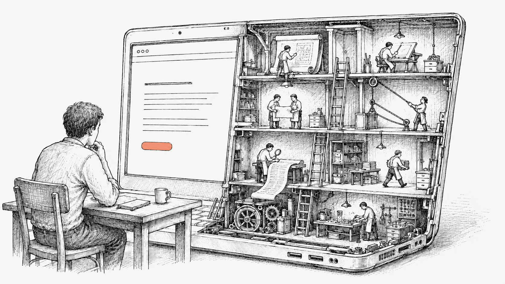
There is a moment, the first time someone opens a drag-and-drop website tool, when the thing genuinely feels like magic. You drop an image onto a page. It crops itself. The text reflows. The colors don’t clash. In an hour, you have a website. In an hour. The thing that used to take a small team and a big invoice now takes an afternoon and a credit card.
The seduction is real, and worth being honest about. The drag-and-drop platforms — Wix, Squarespace, GoDaddy’s website tool, and the rest — are remarkable engineering. They’ve made web design feel easy. That’s a real accomplishment.
This note is about what easy means — and what a studio adds that a tool, on its own, can’t.
— One small example
Imagine someone visits your business’s website on a phone. They want to call you. They tap your phone number, the phone dials, the call connects. That’s the obvious behavior — it would be strange if it didn’t work that way.
Now imagine the same person on a laptop. They tap your phone number. What should happen?
The phone can’t dial — it’s a laptop. The number could try to open a video-call app, but the visitor might not have one installed, and even if they do, you might not. The most useful thing is probably to copy the number to the clipboard so they can paste it into whatever they’re going to call from. But that’s only useful if the visitor knows it copied. So the site needs to surface that, briefly, in a way that doesn’t get in the way.
Two states. One switch. From the user’s side, dead simple.
Now the question that decides the whole thing: how does the site know which one the visitor has?
Most answers feel obvious until you push on them. Screen size? People have tiny laptop screens and big phone screens. Touch capability? Many laptops are touchscreens; many tablets pair with keyboards. The browser identifier? Spoofable, often wrong, sometimes lying on purpose. Even if you somehow nail it the moment the page loads — what happens when the visitor rotates a tablet, plugs in a keyboard mid-session, opens developer tools to test something, or just navigates from one page to the next on a hybrid laptop?
And that’s just the phone number.
The natural next thought is: fine, I’ll just ask an AI.
And you’ll get an answer. It’ll sound confident. It might even be mostly right. But getting an answer isn’t the whole job — the rest is knowing whether the one you got is correct, noticing what isn’t in it at all, and asking the next question. That part is what experience is for.
— What experience adds
The phone number is one example of one decision. The same shape of question repeats throughout a site, in places a customer wouldn’t typically think to look — how a site behaves when a search engine crawls it, what quietly protects it from the kinds of attacks the average visitor never sees, how it performs on devices nobody at the project ever owned. The platforms handle some of this by default. A studio decides which of it actually matters for your site, and does it on purpose.
That’s the technical layer. There’s another layer that comes even before — and it’s where most of the real work happens.
A customer arrives with words. Clean. Modern. Approachable. Professional but not corporate. These are real words — they mean something to the person saying them — and they’re also the start of a conversation, because that exact phrase describes a hundred different sites, and only one of them is the one that’s yours.
Some of what we bring isn’t on the brief.
Most of what a studio does, before any design begins, is figuring out which version of clean and modern is the one a customer would actually recognize as theirs. That work is mostly listening — to what they say, but also to what they don’t say, what they almost say, what they react to when shown an example. There’s a process to it: a way of stepping a customer through choices that helps them hear their own voice, even when they think they already have it.
Then comes the rendering. A website speaks through every choice it contains — the colors, the type, the imagery, the rhythm of how it moves when you scroll, the way it responds when you interact with it. Every one of those is a sentence in a paragraph the site will be saying, silently, for as long as it exists. The platforms make those sentences by default — colors that don’t clash, type that’s legible, motion that doesn’t break. Default is a real accomplishment; the alternative is much worse. But default isn’t yours.
A studio’s job is to make every one of those sentences on purpose, and to make them sound like the customer. By the time the site is built, you recognize it as yours the moment you see it.
— What ‘easy’ actually is
The word easy describes a customer’s experience of using a tool. It does not describe the work. The work is the same; somebody has to do it. The platforms moved most of it offstage — into templates, defaults, and the long-ago decisions of an engineering team you’ll never meet. What they sell is a clean interface and a fast result.
What they don’t include is the part of the work that involves listening to you, considering your business, and bringing experience to the choices that decide how the site actually performs. A studio adds that part. The result is the same kind of artifact — a website — but with the questions answered on purpose, by someone whose job is knowing which ones matter.
Easy isn’t free. The work still gets done. The choice is who’s doing it, and how much of you is in the result.